Overview
What is Kandy?

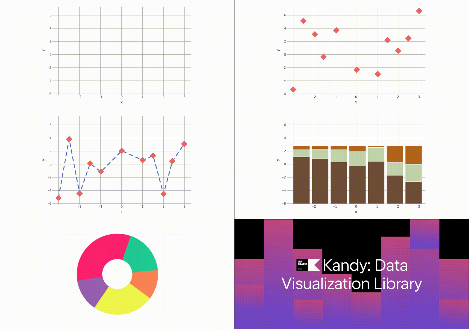
Kandy is an open-source data visualization library designed for Kotlin. It adopts a modern approach to data visualization, offering an idiomatic and flexible DSL. This DSL, integrating seamlessly with Kotlin's type safety, facilitates quick graph creation with fewer exceptions. Kandy also supports various popular engines, enhancing its versatility and performance for efficient chart-building.
Kandy utilizes the Lets-Plot library, which allows it to display in interactive notebooks, saved as standalone HTML files, and export in formats like PNG, SVG, and JPEG. This capability enables the use of Kandy in Kotlin projects.
Alongside kandy-lets-plot, there is an ongoing development of kandy-echarts, an experimental module utilizing echarts.js for rendering.
Features
Hierarchical DSL — Provides an intuitive and straightforward approach to constructing graphs.
Support for Kotlin notebooks — Facilitates working with Kandy on platforms like IntelliJ IDEA with the
Kotlin Notebook plugin,
Datalore, and
 Jupyter Notebook.
Swing rendering in Kotlin notebook — Available in IntelliJ IDEA.
Interactive tooltips — Offers dynamic tooltips during rendering in both Swing and HTML.
Kotlin collections support — Seamlessly works with Kotlin’s standard collections as data sources.
Kotlin DataFrame support — Integrates with Kotlin DataFrame, utilizing generated extension properties and hierarchical data for plot construction.
Type and null safety — Ensures type safety and Kotlin null safety.
DSL and Syntax
Kandy features a common API that facilitates the Plot Intermediate Representation (IR). Both kandy-lets-plot and kandy-echarts are developed to be compatible with this API.
Kandy's DSL offers an intuitive, hierarchical approach to creating data visualizations. Its flexible yet structured design is suitable for both beginners and experienced users. Here's a simplified overview of the Kandy DSL structure:
Plot — the
plotblock forms the foundation of every visualization in Kandy, setting the stage for all other elements.Data Manipulation — this block plays a key role in transforming the initial data utilized in
plot.Grouping — this method groups data according to specified keys, allowing for organized and structured visualization based on distinct data segments.
Statistical — this set of methods applies statistical operations to the data, producing new datasets derived from these computations.
Layout — this part deals with the graph's design, including elements like titles, subtitles, size, and thematic elements.
Layers — it introduces different types of visual elements, such as lines, points, bars, etc.
Aesthetic Mappings / Settings — This feature enables mapping data attributes to visual properties like color, shape, and size, offering extensive customization options.
Scale Specification — this aspect is crucial for translating data values into appropriate visual scales on the graph, including settings for color gradients, size ranges, and positioning.
Kandy's DSL offers a straightforward path for creating visualizations, combining clarity and aesthetic appeal. Its design focuses on ease of use, enabling the efficient crafting of complex charts.
Syntax
Kandy's API follows the structure outlined below:
Basic plotting with initial data:
Transforming data into plotting context:
Combining original and transformed data:
Modifying plot layout:
For mappings and settings, Kandy uses the following approach:
Mapping to a Collection or Column is done through function calls:
Settings for positional aesthetics:
Settings for other aesthetics:
Now that we've covered Kandy's DSL components and structure, let's see how they work together in a practical example. This demonstrates the DSL's capability in crafting a visualization with ease and flexibility:
More examples of working with the library can be found here.