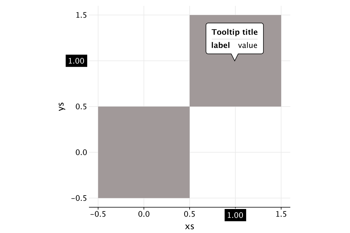
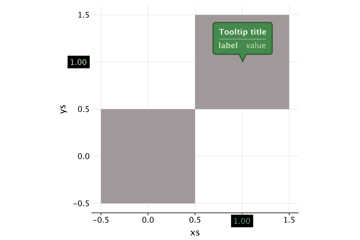
Tooltips
You can customize the content of tooltips for the layer by using the parameter tooltips of layer functions.
The following parameters and functions set lines, define the formatting of the tooltip, its location and width:
Tooltip variables parameter (optional)
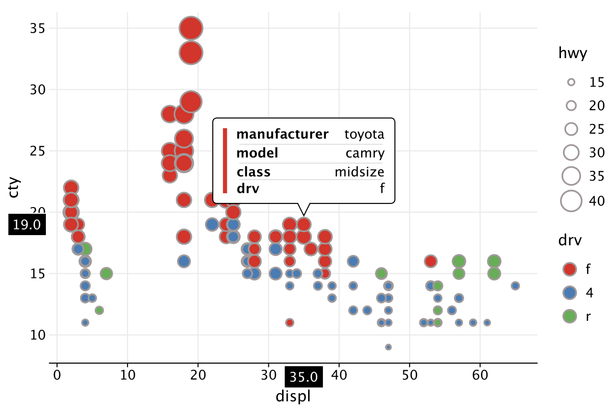
The variables parameter defines a list of variable names, which values will be placed line by line in the general tooltip. If formatting is specified for a variable from this list (with the format function), it will be applied. Otherwise, the default formatting is used. Additional tooltip lines can be specified using the line functions.
This is useful for configuring the tooltip content, instead of using the line() method to configure each line of the tooltip.
Set the list of variables to place them in a multiline tooltip with the default formatting:
untitled | manufacturer | model | displ | year | cyl | trans | drv | cty | hwy | fl | class |
|---|---|---|---|---|---|---|---|---|---|---|---|
1 | audi | a4 | 18 | 1999 | 4 | auto\(l5\) | f | 18 | 29 | p | compact |
2 | audi | a4 | 18 | 1999 | 4 | manual\(m5\) | f | 21 | 29 | p | compact |
3 | audi | a4 | 2 | 2008 | 4 | manual\(m6\) | f | 20 | 31 | p | compact |
4 | audi | a4 | 2 | 2008 | 4 | auto\(av\) | f | 21 | 30 | p | compact |
5 | audi | a4 | 28 | 1999 | 6 | auto\(l5\) | f | 16 | 26 | p | compact |
Tooltip formats parameter
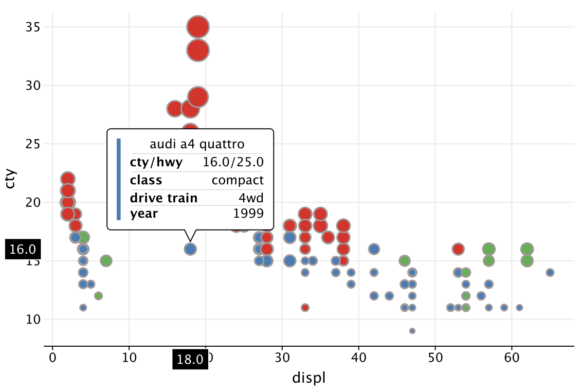
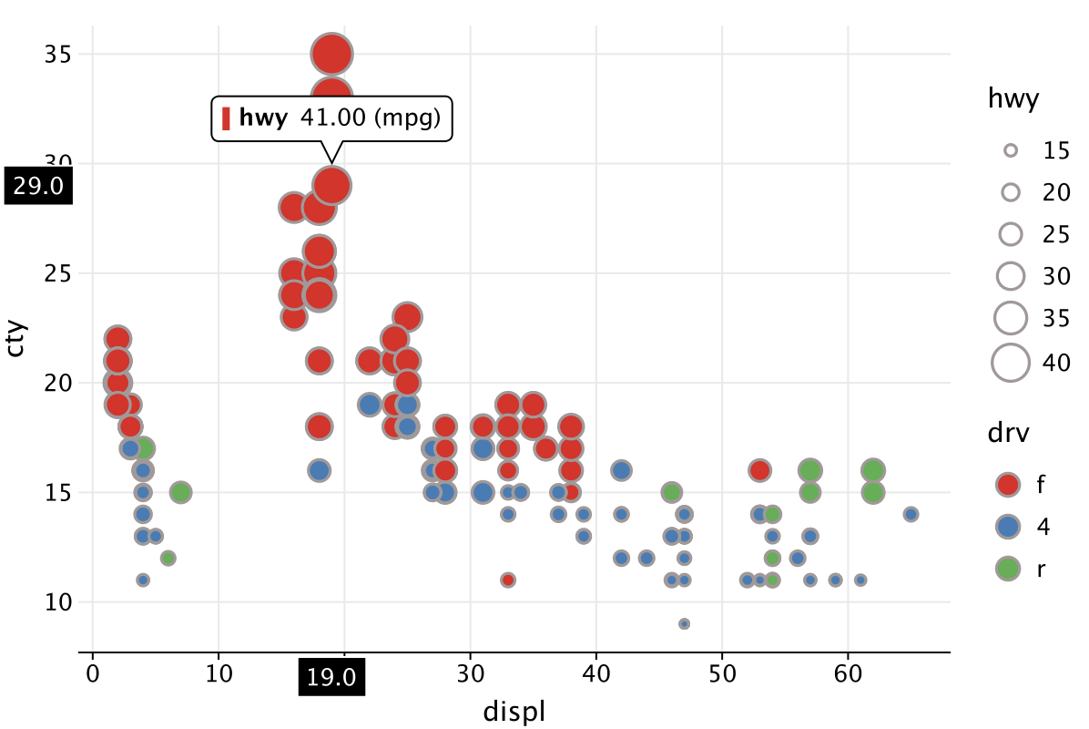
Parameter formats defines the format for displaying the value. The format will be applied to the mapped value in the default tooltip or to the corresponding value specified in the line template. The format to apply to the field. The format contains a number format ('1.f') or a string template ('{.1f}'). The numeric format for non-numeric value will be ignored. The string template contains “replacement fields” surrounded by curly braces {}. Any code not in the braces is considered literal text, and it will be copied unchanged to the result string. If you need to include a brace character in the literal text, it can be escaped by doubling: {}. For example:
cty to ".1f")->"17.0"cty to "{.2f} (mpg)"))->"17.00 (mpg)"cty to "{{{.2f}}}")->"{17.00}"model to "{} {{text}}")->"mustang {text}"
Customizing tooltip lines
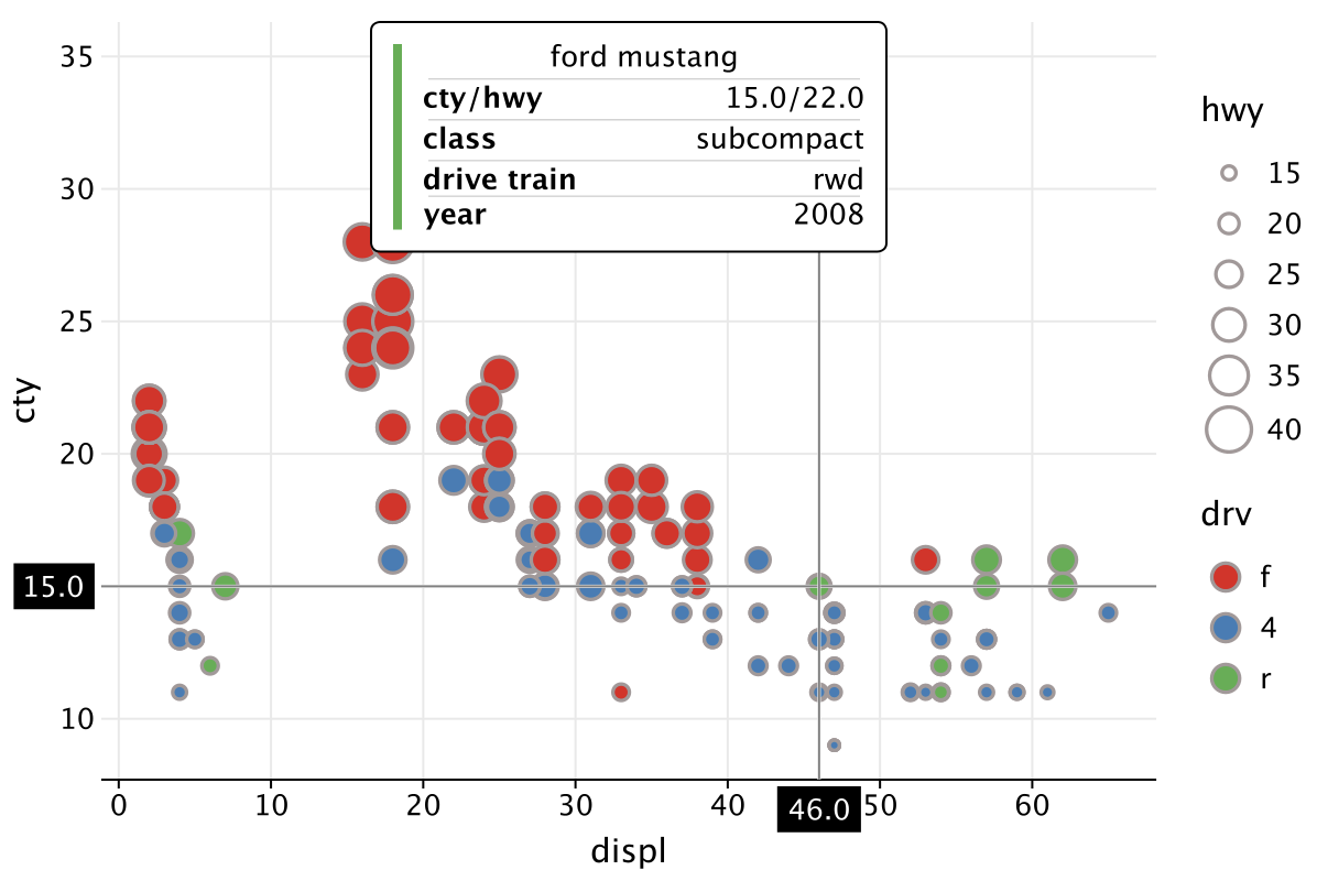
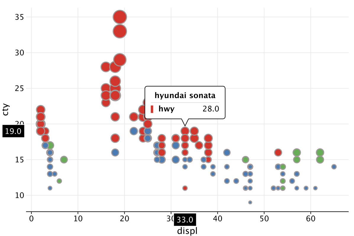
Specifies the string template to use in a general tooltip. If you add line(), it overrides the default tooltip.
line("text")->"text"line("{{text}}")->"{text}"line("${value(model)}")->"mustang"line("${model.tooltipValue()}")->"mustang"
Labels configuration
The default tooltip has a label before the value, usually containing the name of the mapped variable. It has its own behavior similar to a blank label for an axis aesthetics. This default label can be set in the template by using a pair of symbols @|. You can override the label by specifying a string value before | symbol.
Within the tooltip line, you can align the label to left. The string formed by a template can be aligned to right. If you do not specify a label, the string will be centered in the tooltip. For example:
line("^color"): no label, value is centered;line("|^color"): label is empty, value is right-aligned;line("@|^color"): default label is used, value is right-aligned;line("my label|^color"): label is specified, value is right-aligned.
Tooltip Title Parameter
Adds a title template to the tooltip.
The specification rules are the same as for the line() function.
A long title can be split into multiple lines using \n as a text separator.
Tooltip anchor
Specifies a fixed position for a general tooltip.
The Anchor object accepts the following values:
TOP_RIGHTTOP_CENTERTOP_LEFTBOTTOM_RIGHTBOTTOM_CENTERBOTTOM_LEFTMIDDLE_RIGHTMIDDLE_CENTERMIDDLE_LEFT
Minimum width of general tooltip
Specifies minimum width of a general tooltip in pixels.
Change format for the default tooltip:
Place a general tooltip at the top center and define its minimum width:
Move the tooltips to the top right corner:
sepal_length | sepal_width | petal_length | petal_width | species |
|---|---|---|---|---|
5.1 | 3.5 | 1.4 | 0.2 | setosa |
4.9 | 3 | 1.4 | 0.2 | setosa |
4.7 | 3.2 | 1.3 | 0.2 | setosa |
4.6 | 3.1 | 1.5 | 0.2 | setosa |
5 | 3.6 | 1.4 | 0.2 | setosa |
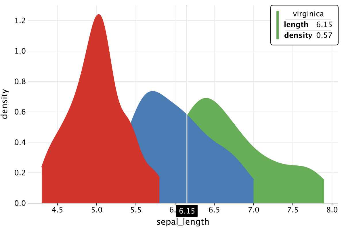
Side tooltips configuration
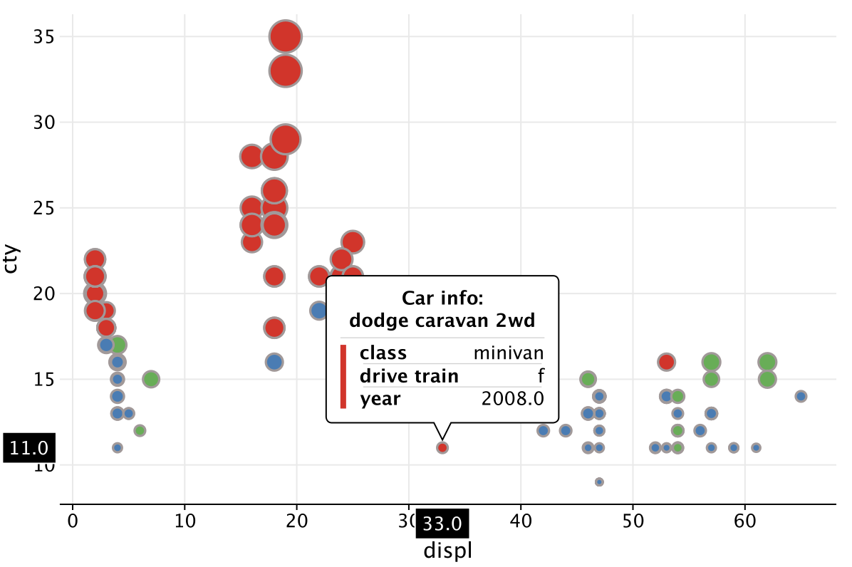
In Kandy, certain aesthetics by default are represented by a so-called "side tooltip" — a small tipped box containing just a single numeric value.
You can override these defaults using the line() function. Configuring a "line" in a general multi-line tooltip disables side tooltip for the correspondent aesthetic.
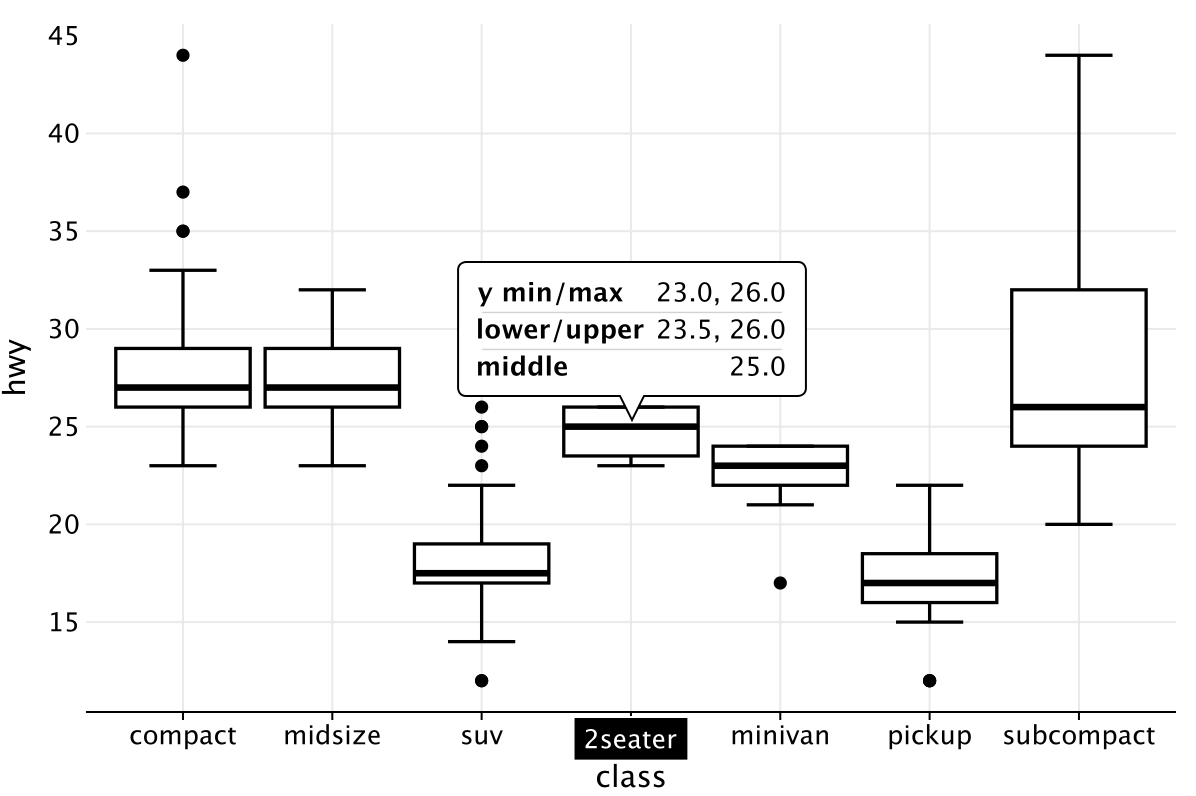
Place the tooltip at the top center:
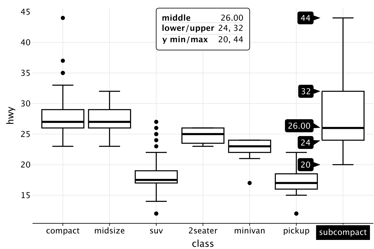
Hiding tooltips
Set tooltips(true) to hide tooltips from the layer.
To hide axis tooltips, you can set "blank" parameters of the style() function.
Tooltip Title
Splitting text using \n
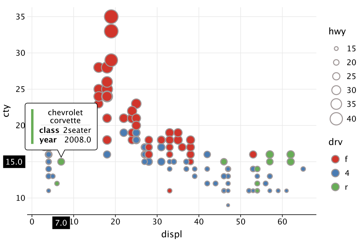
Adding a title
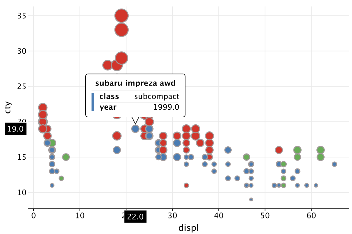
Tooltip Style
